Design systems fail when they become a second product. Tokens, variants, documentation, and a backlog of “we should add this.” Meanwhile the live app still has three button styles. Teams that hate maintenance are not lazy. They are protecting the work that ships. The system has to earn its keep in that work.
Ship the five things you already repeat
Start with color, type, spacing, a button, and a form field. If those five are honest, the rest of the UI can wait. Every extra component is a promise to keep it current. We would rather a thin system that matches production than a library that drifted last quarter.
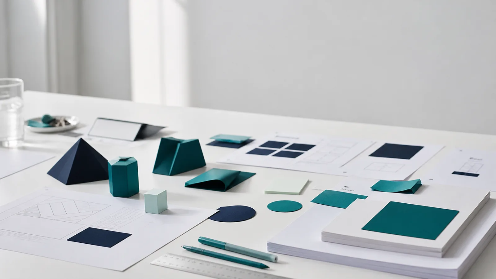
- Tokens first. If navy, teal, and mint only exist as hex in Figma comments, they will drift.
- One primary action per view. If every button is “important,” none of them are.
- Document how to say no. A system without a reject path becomes a dumping ground.
Own it in the repo, not in a slide
The source of truth is the code the product imports. A Figma file that does not match the repo is a mood board. Put the tokens next to the components. When a color changes, it changes in one place. When a pattern is unused for two releases, delete it. A smaller system is easier to love.
Let the product be the review
Do not hold a monthly “system health” meeting that nobody attends. Review the live screens. If a new card appears that is not in the system, either absorb it or kill it in the next sprint. That is the whole process. Stacknify uses the same rule on client work: the interface people click is the system. Everything else is notes.