
Back to projects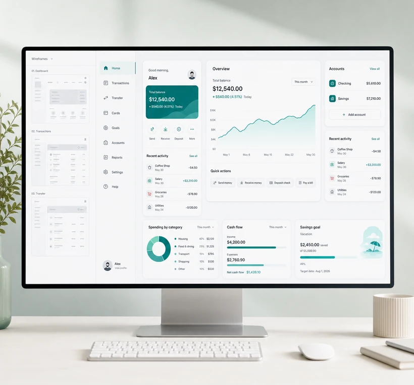
SaaS · UI / UX Design
SaaS Dashboard UX
The dashboard works technically and still fails at usability, navigation, and data clarity.
01/03
Product views
What we built
The dashboard worked technically and still failed at usability, navigation, and data clarity. Operators should not need a legend to read the numbers they use every morning.
We moved from wireframes to a high-fidelity SaaS interface in Figma, then into React and TypeScript. The redesign is product design for density: hierarchy, navigation, and data people can scan.
- Challenge
- The dashboard works technically and still fails at usability, navigation, and data clarity.
- Approach
- Move from wireframes to a high-fidelity interface that people can read at a glance.
- Solution
- A SaaS dashboard UX redesign focused on usability, navigation, and clearer data.
- Technology
- FigmaReactTypeScript
Outcome
Outcome not published.
Start a similar project
Interested in work like this? Tell us about the problem.